Your Apps Are Gaslighting You: The Rise of Dark Patterns in UX Design
Welcome to the Interface That Lies to You
You’ve seen it:
- “Are you sure you want to leave?” pop-ups
- “Delete account” buried behind five menus
- One-tap subscriptions…but 10-step cancellations
Welcome to dark patterns — design that doesn’t serve you.
It manipulates you.
What Exactly Are Dark Patterns?
The term dark pattern was coined by UX designer Harry Brignull in 2010 to describe design choices that trick users into doing things they didn’t intend.
Instead of helping you decide, dark patterns nudge, trap, or guilt you into doing what benefits the company.
Examples you’ve definitely met:
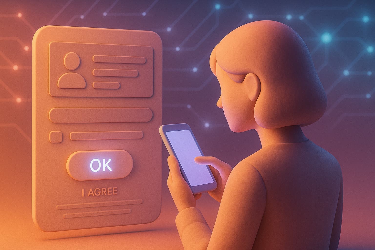
✅ Confirmshaming
“No thanks, I hate saving money.”
✅ Roach motel
Easy to sign up, nearly impossible to leave.
✅ Forced continuity
“Free trial” that renews without notice.
✅ Sneak-into-basket
Pre-checked boxes for add-ons or subscriptions.
Each one is technically legal… but ethically gray.
Why Companies Use Them
One reason: they work.
Dark patterns exploit psychology of attention.
When users are tired or rushed, they just click to finish.
Designers use:
- Bright colors for “Yes”
- Dull gray for “No”
- Button placement to guide your thumb
Every hesitation in your brain has a price tag.
Retention and revenue have replaced ethics.
Most apps don’t ask “What’s right?”
They ask “What converts?”
The Gaslighting of the Digital Age
The brilliance of dark patterns?
They make you doubt yourself.
“Did I miss the cancel option?”
“Maybe it’s my fault — I didn’t read.”
That’s intentional.
The system is built to make your confusion feel like incompetence.
It’s UX gaslighting —
The design lies, then makes you blame yourself for falling for it.
The Evolution of Manipulation
Early dark patterns were obvious.
Today, they’re personalized and AI-driven.
Modern systems adapt in real-time:
- Test your patience
- Track your scroll speed
- Detect when you might give up
Then they adjust the interface to push you over the edge.
A “limited-time offer” may last exactly as long as your attention span.
“Free shipping” may appear only when you hesitate.
This isn’t a bug.
It’s engineered deception.
Where Privacy and Design Collide
Dark patterns don’t just manipulate.
They collect.
Every rage-click, hesitation, or “Manage cookies” attempt is recorded.
“Reject All” is hidden.
“Accept All” is bright.
You click… and your data is sold.
Your confusion becomes consent.
Even if privacy laws exist, once the data is captured, it’s too late.
Regulators finally noticed:
- 2022: U.S. FTC warns dark patterns may be “deceptive business practices.”
- EU Digital Services Act: Bans designs that “distort or impair user choice.”
The war has begun —
but design is evolving faster than the law.
How to Spot and Avoid Dark Patterns
Even tech-savvy users fall for them — that’s the point.
Here’s how to defend yourself:
✅ Slow down. If the interface feels rushed or emotional, it’s manipulating you.
✅ Check symmetry. Is “No” hidden while “Yes” is bright?
✅ Read before clicking “Continue.” It often hides consent.
✅ Use privacy-focused browsers & extensions. Block tracking and cookie traps.
✅ Cancel subscriptions the same day. Don’t trust reminders.
Awareness is the first shield.
Discipline is the second.
The Ethics of Design in the Age of AI
AI makes this problem terrifying.
Instead of one static trick, AI can generate dynamic interfaces that morph based on your psychology.
Every time you outsmart a pattern,
a smarter one learns from you.
If every app you use feels addictive…
That’s not coincidence.
That’s optimization.
The only real solution is transparency — culturally, not just legally.
Designers must ask:
“Would I want this done to me?”
Until then, assume:
Every click is a negotiation.
In the End, It’s About Trust
Technology was supposed to empower us.
Instead, design has become a psychological battleground.
So next time a button guilts you into clicking, remember:
You’re not indecisive.
You’re not careless.
You’re human.
And someone out there
designed a system to take advantage of that.